path = [[1,1], [2, 1], [2,2], ...]
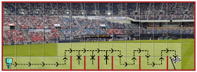
With the appropriate information given, the task shown to the user includes a visual view of the path to follow. This is what it looked like:
This works well. However, if Reeborg has to retrace some steps, to accomplish the task, the two arrow heads visually combine and appear to form an X which could be interpreted to mean that a given path segment should not be included.
(In addition to the arrow heads combining to look like an X, the dashes do not overlap and instead combine to form a solid line.) Most users of Reeborg's World are students learning in a formal setting. I surmise that those teachers quickly figured out what the correct information was and never reported it. As I created this visual information, I knew its meaning and was simply blind to the other possibility.
A while ago, a user learning on their own asked me why their program was not working. After a few email exchanges, I finally understood the source of the confusion. I took note of it. I had a quick stab at finding a better way but it didn't work.
A couple of days ago, a second user learning on their own contacted me with the same problem. Clearly, something had to be done ...
This is what it now looks like
In addition to clearing the confusion (or, I hope it does), I actually think it looks much nicer. This improvement would not have been possible if I didn't get some user feedback. This is why I am always thankful when someone contact me to suggest some improvements -- even though I may not always be in a position to implement the required changes quickly.


No comments:
Post a Comment
Spammers: none shall pass.
Note: Only a member of this blog may post a comment.